Riley Renovators
*
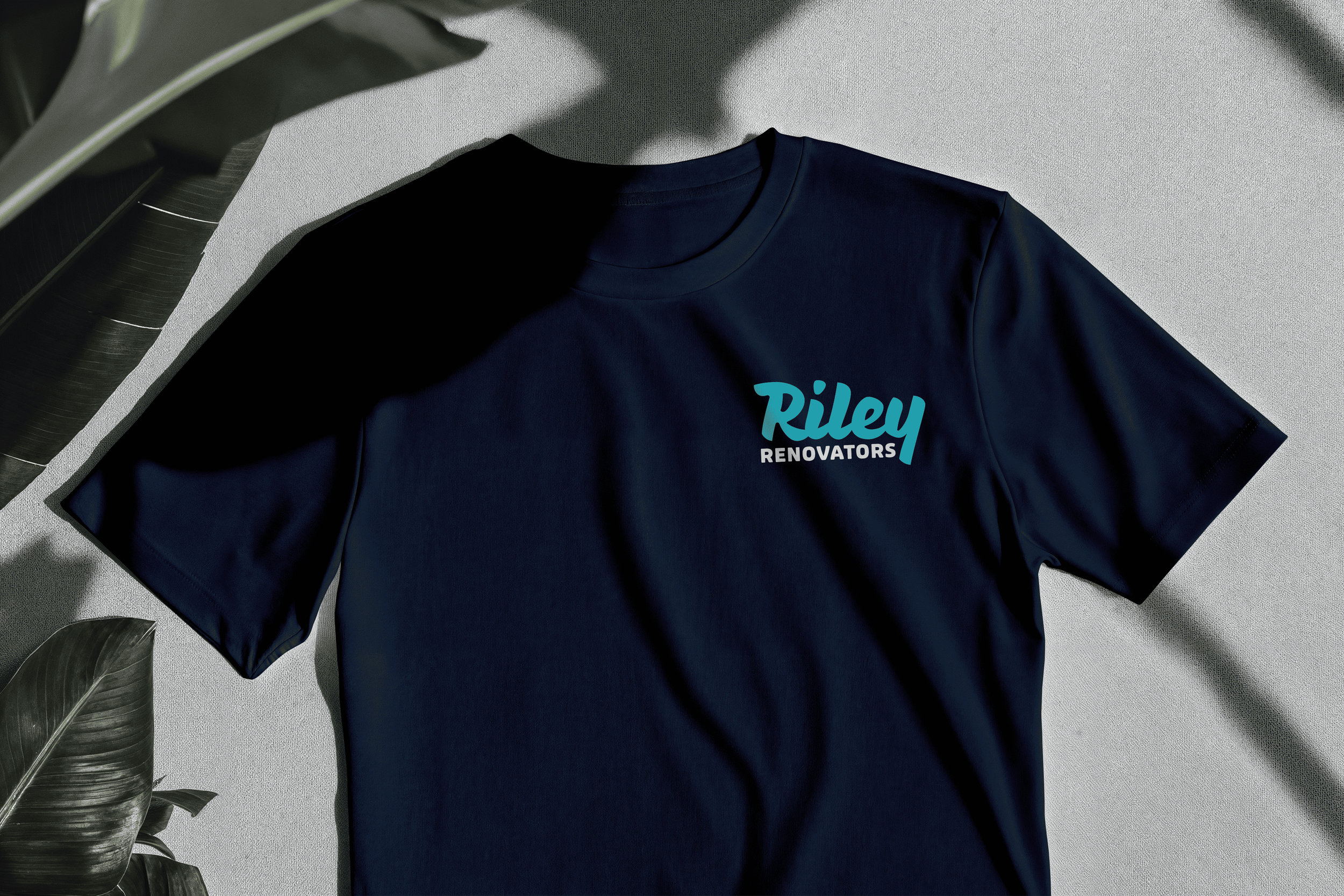
Riley Renovators *
Riley Renovators
2025
“We…love to create a feeling of individuality and warmth in a home.” Riley Renovators is a trusted building company located in the Blue Mountains. The company seeks to refresh their visuals whilst maintaining their ways of standing by old-fashioned values.
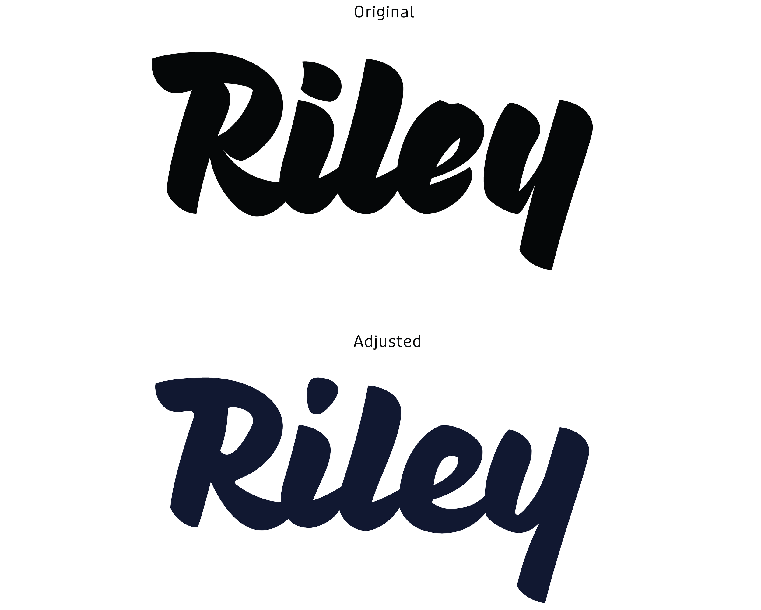
The original cursive typography is shifted into more fluid and hand-written letterforms, paired with a bold soft-edged type. The subtle contrast reflects the brand vision of delivering both inviduality and sense of warmth. The increased weight of the wordmark aims to improve legibility, allowing each letter to be more prominent. Overall, the logo is modernised whilst still retaining aspects of the original logo.
Typographic Choices
To establish stronger hierarchy in the logo, I created variation in size and weight to create emphasis on the name. The primary font ‘Pique’ was chosen for it’s hand’written marker quality, this evoked the company’s authentic, and approachable brand personality.
This script font was slighty altered, softening the edges of the letterforms and reducing the thickness to make it appear more cohesive and legible.